Robots with Style I: The Art of AEGIS


A.E.G.I.S. is more than an awesome strategy game, it’s a combining robot strategy game, and it needs to show it. The game’s art style has many complex needs, and every robot’s appearance has to adhere to our style guide. As in, every single robot in the game has to appear different from every other robot, follow what other robots in the same Class look like, represent what they do in-game, and if it’s a Combined Unit it has to look like what it’s made up of. Today I’ll be talking about why do the robots in A.E.G.I.S. look the way they do.
United Robots, Unified Style

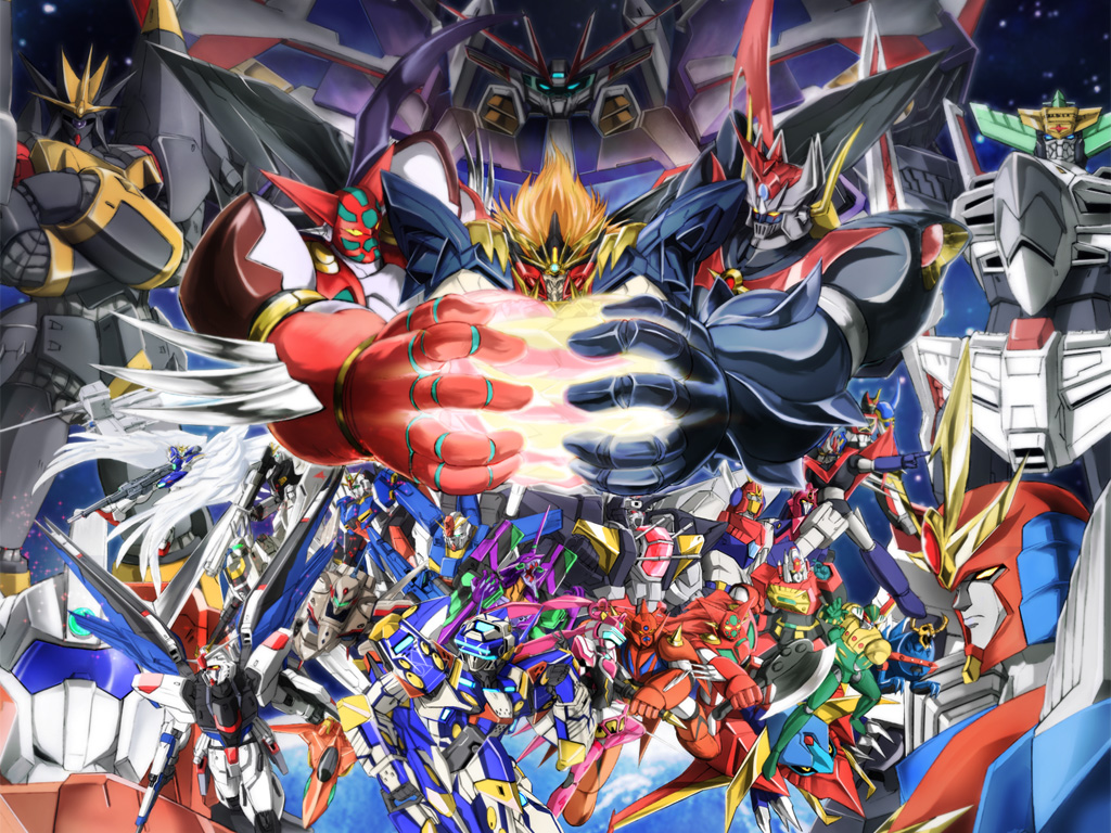
The overall style for A.E.G.I.S. came naturally, it was always supposed to be a love letter to Super Robot anime, Power Rangers and the other shows I loved and grew up with. There are many other different kinds of robots in popular culture, from gritty realistic mecha like MechWarrior to far more cartoony works like Mixels, and A.E.G.I.S.‘ style falls right in between, giving us the ability to show of badass designs while retaining a more accessible toon-ish charm.
One of the biggest influences in our art style is the cast of robots in GAINAX’s Tengen Toppa Gurren Lagann, which have a very slick, dynamic feel while also being semi-organic and brightly colored. Similar to TTGL, no robots in A.E.G.I.S. have wheels or treads, because I felt it was important to draw the line between vehicles in robots. Since a lot of robots in the game were already destined to not be humanoid or animalian, I wanted to minimize the chances of the more esoteric designs looking like cars or tanks.
Pieces of a Genre
A.E.G.I.S. has five different Classes of robot, and each does different things in-game. It was also really important for the Classes to be quickly identifiable from each other too, with each of them having their own corresponding color and body style. And with the game being about combining robots, the single-Class units should also look like “components”, allowing art for higher-tier robots to be created much easier by blending together their simple features.
- A-Class robots are always red, bipedal and humanoid, with distinct weapons. They’re the “skeleton” for higher level humanoid robots.
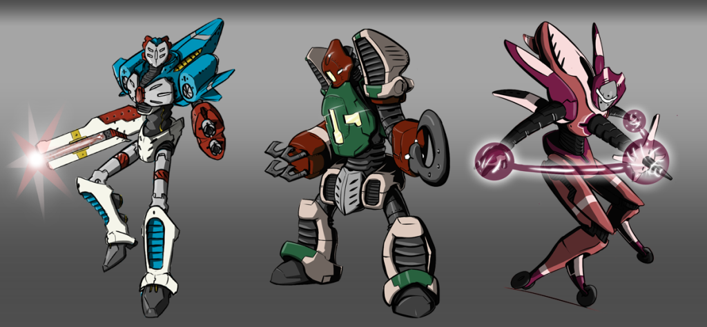
- E-Class robots always have large blue bodies, turbines, wings and/or masks. They tend to form the torso and flying components of a higher level robot.
- G-Class are green and always have large heads, with armored bodies, stout legs, and large weapons. They tend for form the armor and armaments of high-tier robots.
- I-Class are purple, and feature curvy or insectoid forms with rollerball feet, tentacles, and sets of four limbs or antennae. Their higher tier forms take on sleek appearances, extra limbs and/or electrical appendages.
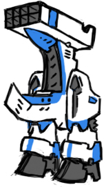
- S-Class robots are white with colored stripes, usually yellow. They have elongated bodies with powerful legs and many vents. They tend to form the bulk of higher-tier robots.
Using these guidelines, an ES-Class will always look different from an AS, GS or IS and be identifiable as an ES every time based on its visual aspects. It allows for the game to create just about any kind of robot in any shape or style.
The same goes for level 3 robots, where an AES, AGS and AIS robots will always have specific aspects that separate them visually from each other.
Sum of Your Parts
Higher-tier robots are visually not just a sum of their parts. Level 3 and higher robots have specific guides to what “makes this guy look like an AES”, and that’s something I’ll talk a bit about in a future art column. Until then, check out some of our other posts, check out our Facebook and Twitter.


